Logo design for Taste of the Fourth, an annual food festival in the OId Fourth Ward of Atlanta, Georgia. I think we all have had projects that went through several concept directions before landing on the final mark — I’ve chosen to share this one as a proof of process.
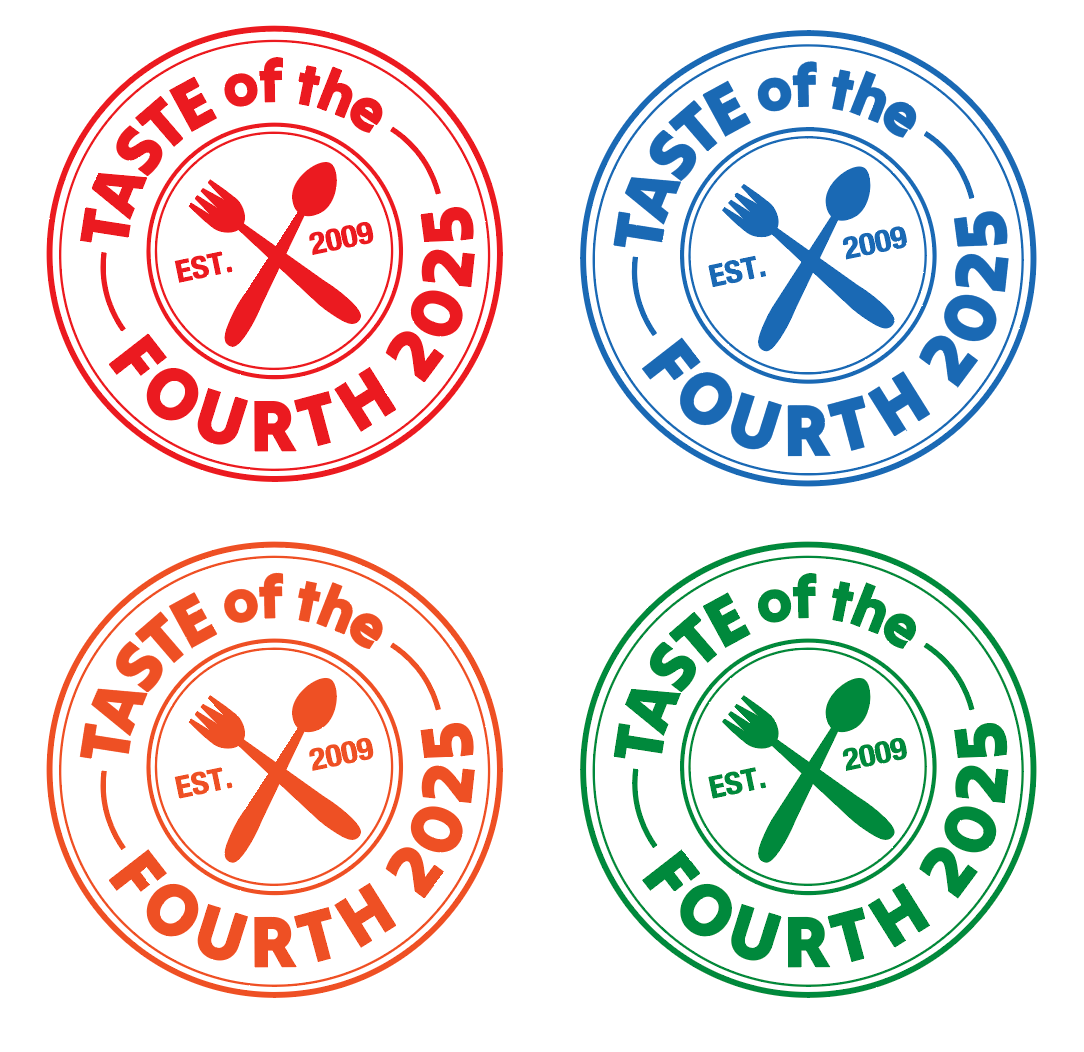
Final Logo
A circular stamp mark with crossed cutlery and arched type — clean, scalable, and works in single color. References the event’s history (est. 2009) while feeling current.
Concept Explorations
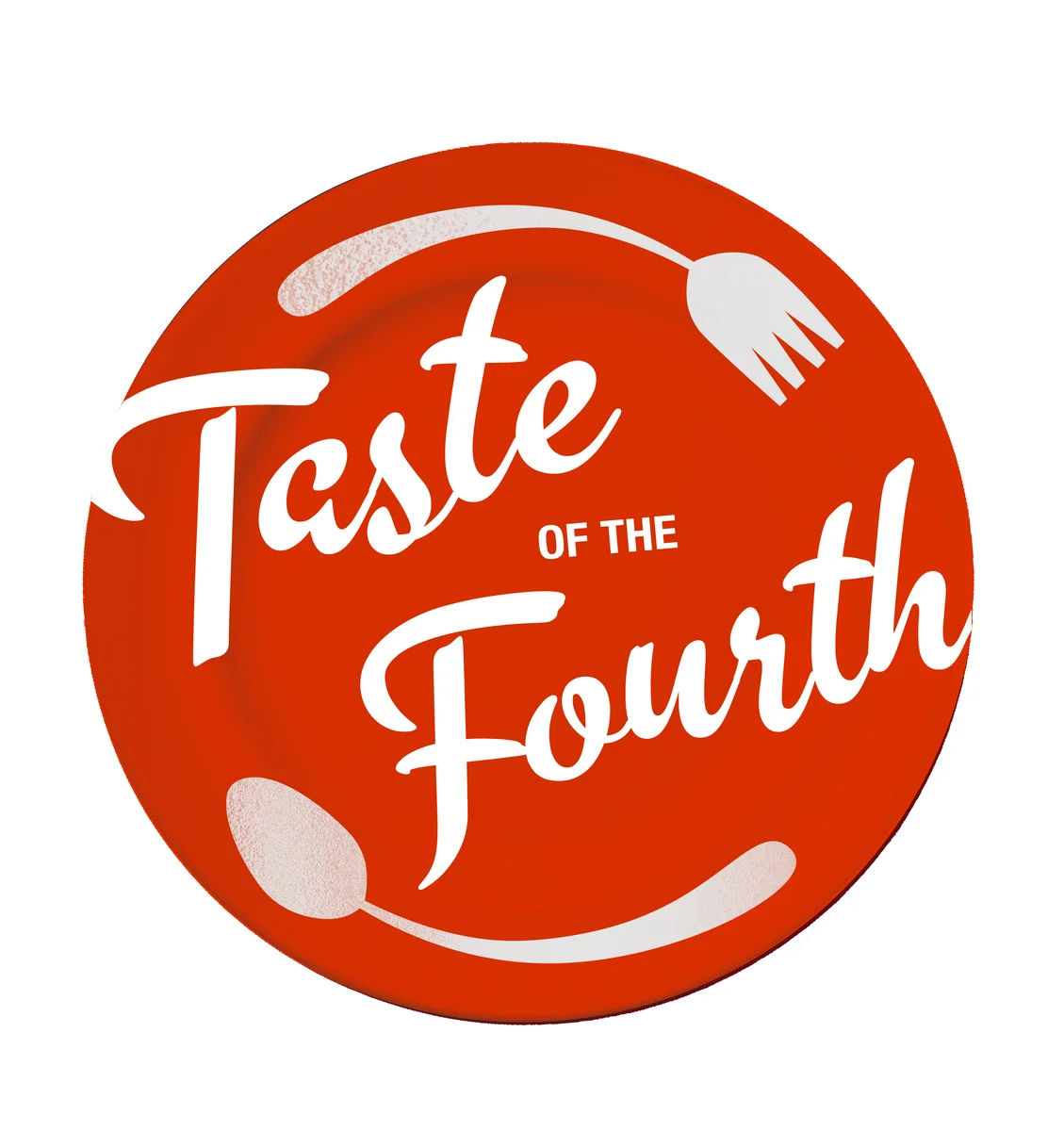
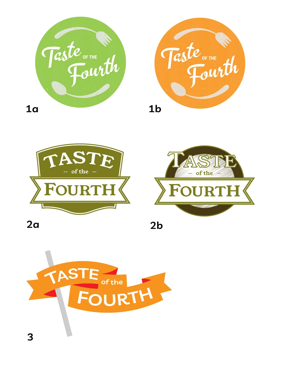
Earlier explorations included a colorful plate-and-cutlery circle, a structured badge, and a ribbon treatment — each going for a different tone before the stamp direction won out.